Money and life goals reimagined
Project / Digital Money Coaching Experience Redesign
Client / Self - Personal
Services / Product Design, Art Direction, Illustration
Year / 2020
Insight
In 2015, Capital One launched its acclaimed Money Coaching service, achieving consistently high customer satisfaction ratings before rolling out the program nationwide. However, digital expansion proved challenging. As the lead product designer, I led a cross-functional team in the creation of an innovative Apple Pencil-driven coaching app. This app featured realistic card mechanics and offered access to eight financial and life tools.
Project
Following my time with Capital One, my passion for design innovation and digital education experiences led to a transformative side project. Drawing insights from nearly two years of program feedback and updates, I reimagined the Money Coaching service into an immersive card game-like experience, diverging from the conventional mentoring session format.
To elevate the experience, I meticulously crafted custom illustrations, enhanced realism through shadows, paper textures and simplified the UI/UX. This project reflects my commitment to pushing design boundaries, seamlessly combining creativity and practicality to elevate the user experience.
Card Game
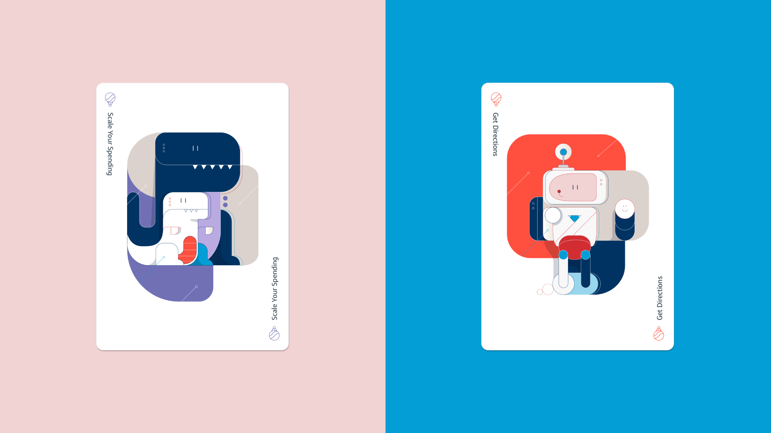
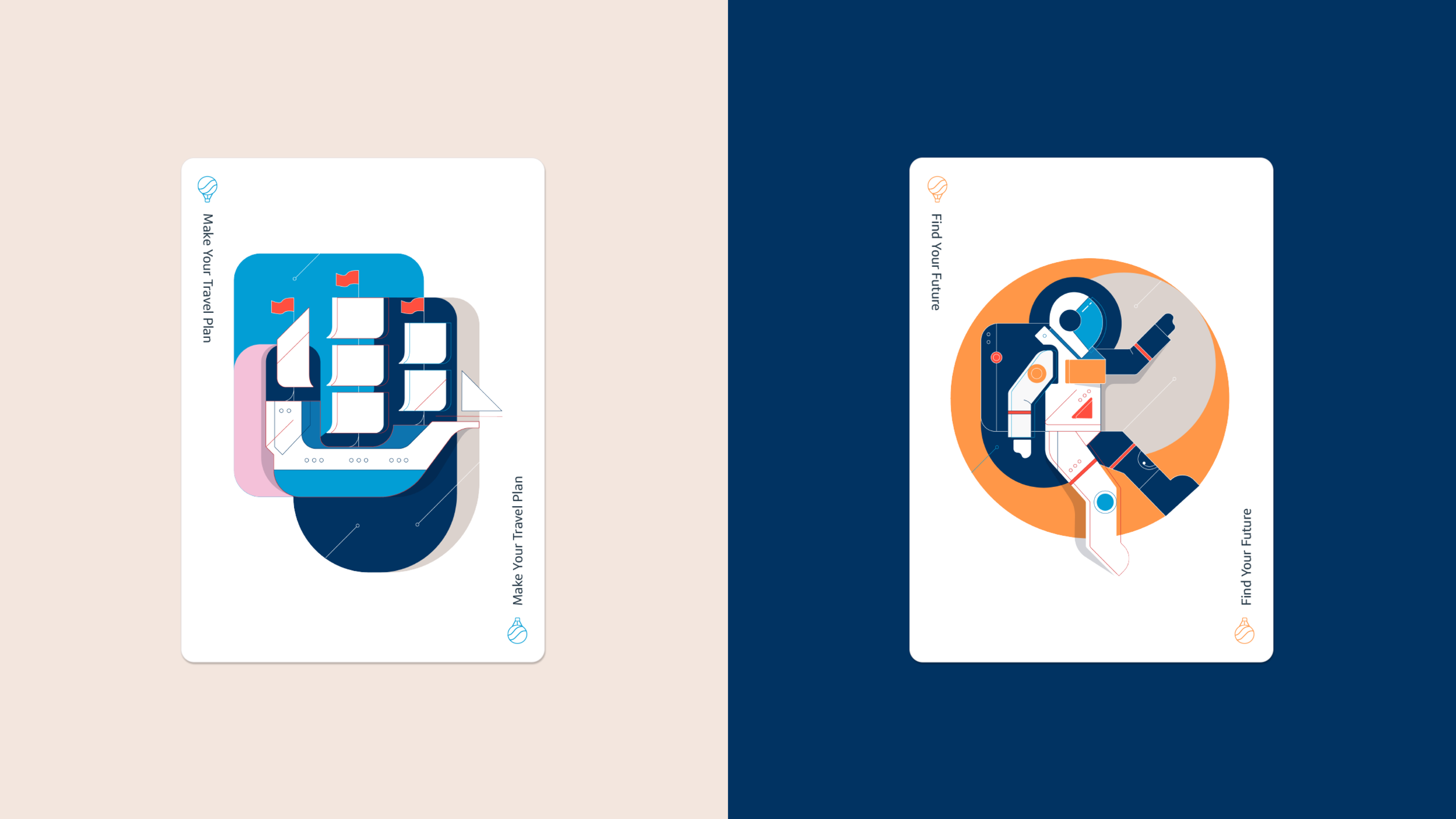
The illustrations drew inspiration from artistic card decks known for their exquisite artwork and precise grid patterns across the entire set. This meticulous attention to detail fosters a deeply personal connection with the program experience, adding significant value for those who engage with it.
Employing a rainbow palette, the focus was on crafting a playful, engaging, and inclusive digital environment. Users were encouraged to explore a diverse range of colors and stickers, enhancing their self-expression and interaction with the digital tools.
Simplifying the card artwork increased memorability and imbued each tool with distinctive personality. Themes such as dinosaurs, spaceships, and robots were integrated, creating a modern, playful tone accentuated by realistic shadow effects and a retro inspired design style. This approach ensured the experience resonated within financial, tech, and education spheres, fostering an atmosphere that champions play and creative thinking.
Realistic UX
Building upon the same admiration and creative spirit found in card decks, I opted to replace modals with lifelike paper folders in the new design approach. These folders, when opened, revealed a wealth of information about each tool, session cards, and offered users the chance to preview before making their selections. These creative adjustments not only enriched the tool selection process but also ensured a transparent understanding of the subsequent steps in the user journey.
Regarding the tool's UX/UI experience, I completed a comprehensive redesign aimed at delivering a more impactful and realistic card game-like experience. While I retained traditional UX features such as a header navigation bar and tabs, the centerpiece of the design was the art board area, which featured natural card aesthetics and creative elements. A stack of lifelike cards in the bottom corner served a dual purpose, symbolizing user actions and indicating the number of cards still available.
To further enhance the user experience, the sticker sheets were expanded to encompass a wide array of colors, with each sticker offering four color variations. This update not only infused the tool experience with added realism but also introduced a vibrant avenue for self-expression akin to the versatility of emojis. These enhancements breathed life into the product, exemplifying how the core educational principles of the program could extend to a broader and more diverse audience.
Dashboard Refinement
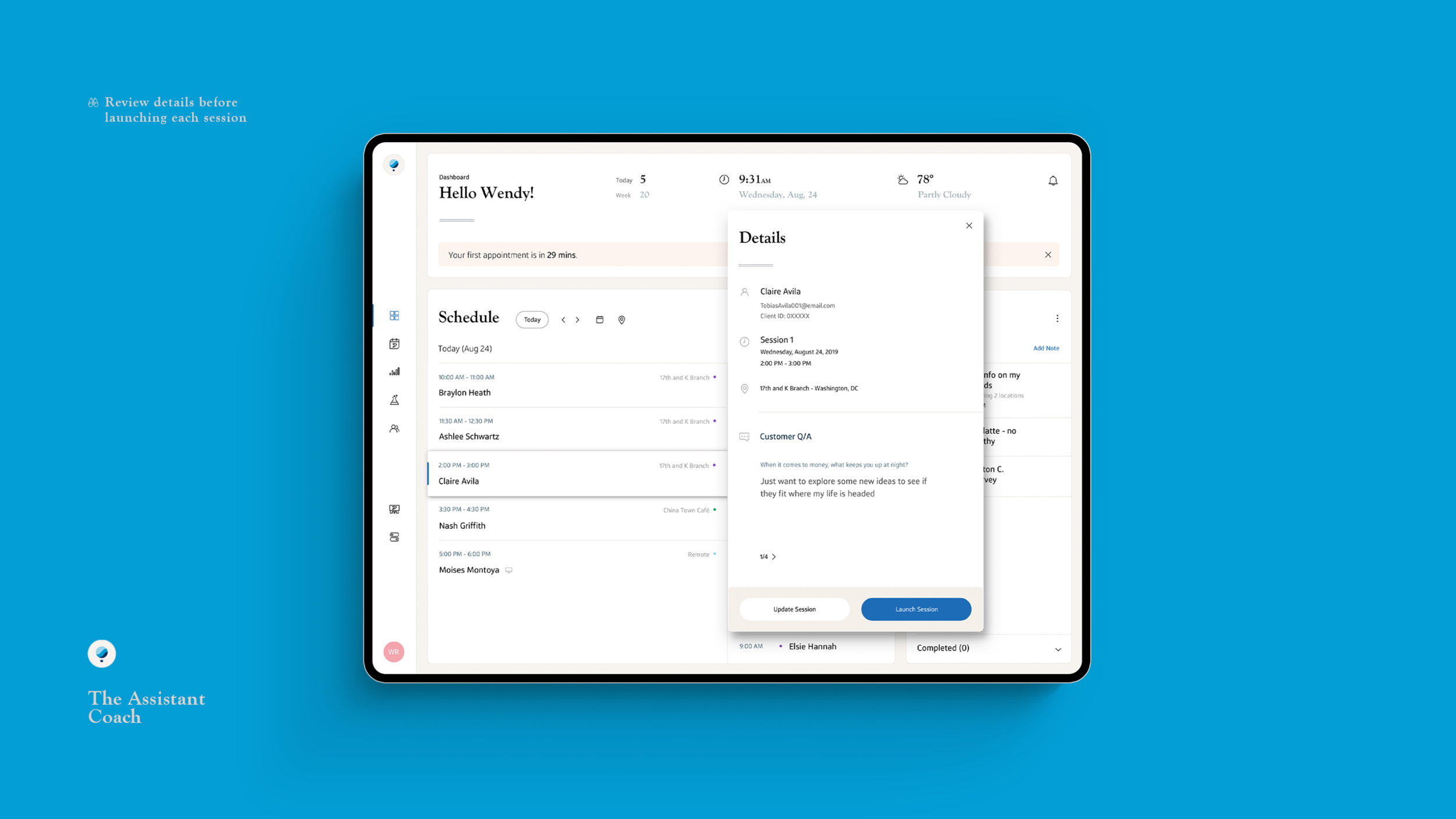
In the final stages of this project, I redesigned the coach dashboard to align with the reimagined money coaching customer journey. This overhaul involved the adoption of clean, warm tones, the integration of approachable serif fonts, and the establishment of a simplified hierarchy, all meticulously crafted to equip coaches for their daily tasks with utmost efficiency.
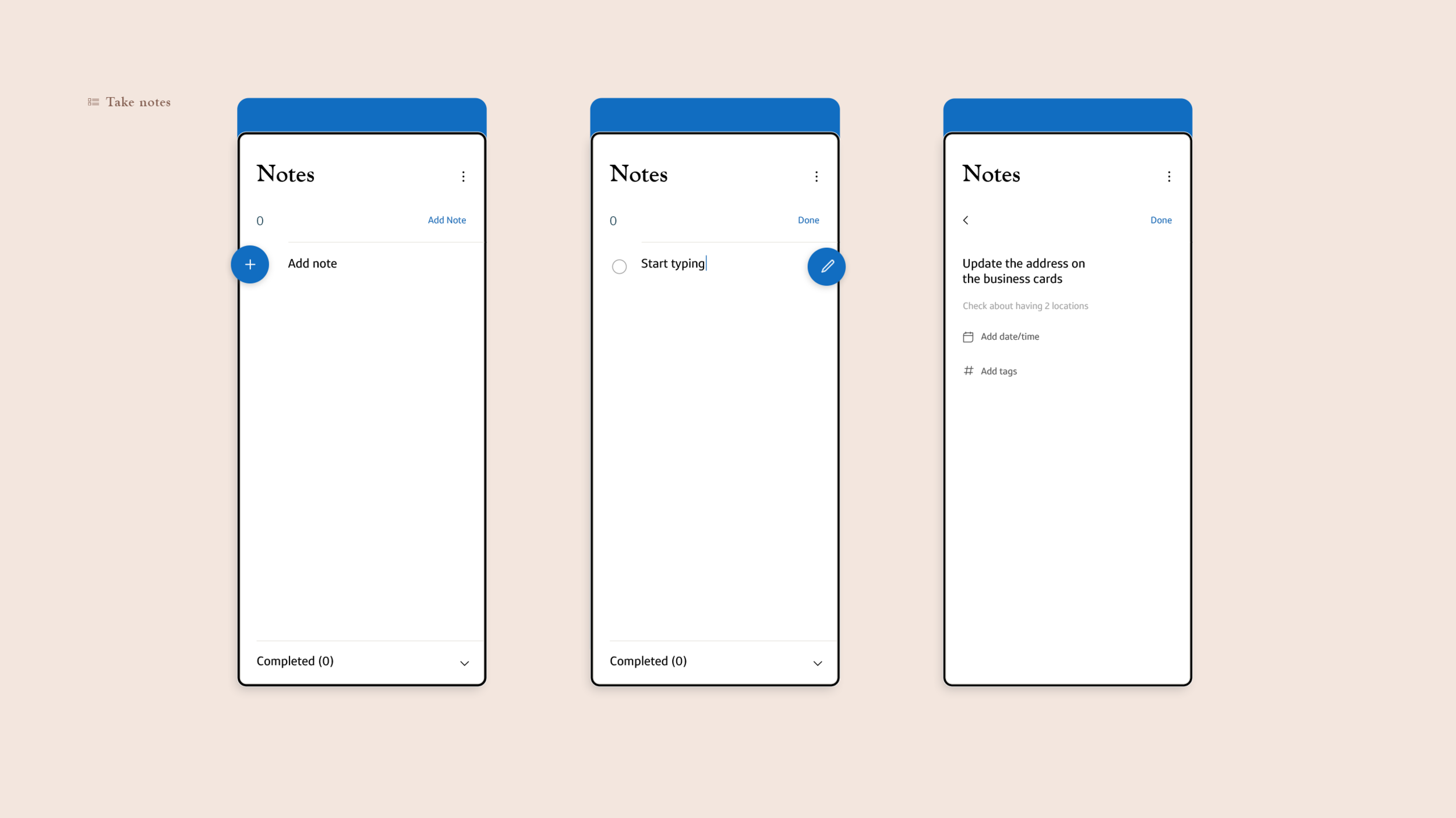
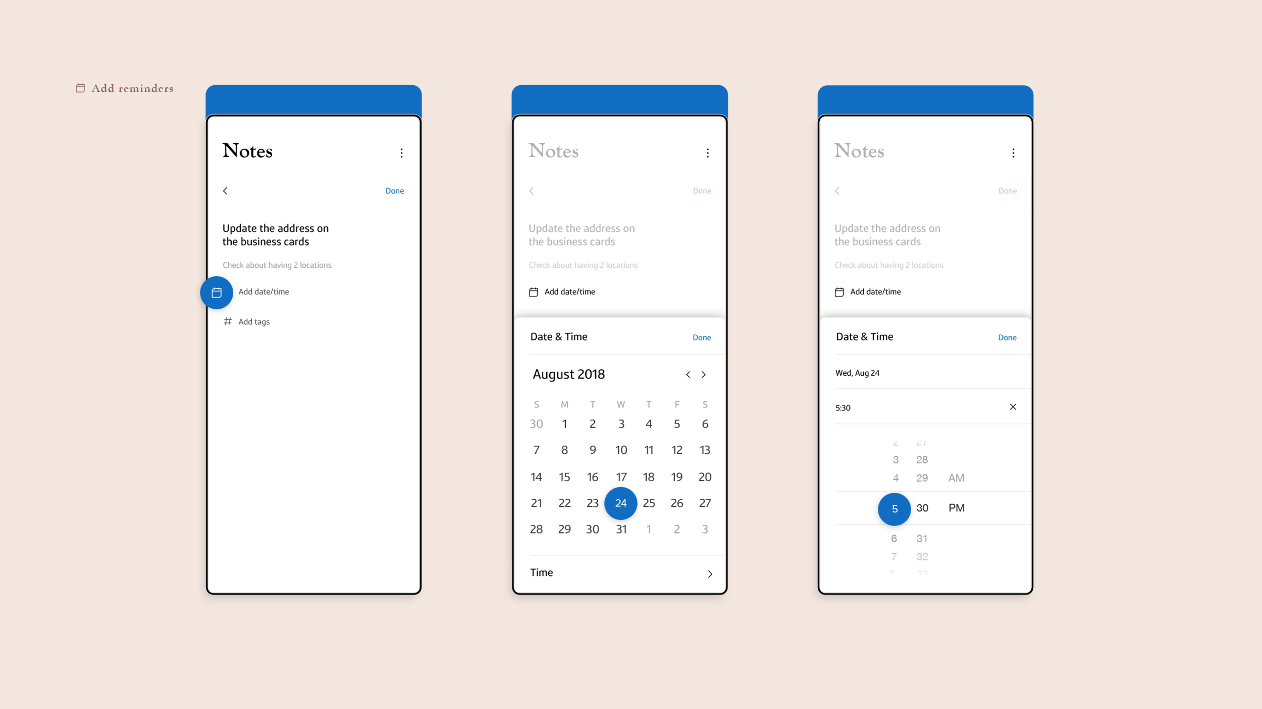
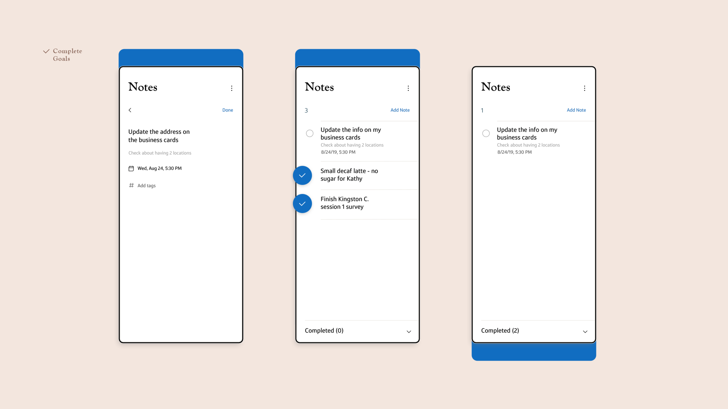
The revamped dashboard introduced integrated color tags and iconography, providing coaches with swift means to identify upcoming appointments and remote sessions. To further streamline the coach dashboard, I integrated a simplified single-panel notes feature directly into the dashboard interface. This provided coaches with convenient access to their booking schedules and daily notes without the need to navigate away from the dashboard.
Moreover, I expanded the sidebar to encompass a comprehensive array of coaching tools. This expanded toolkit included access to invaluable data and insights, a calendar and scheduling system, as well as individual cafe concierge offerings and communication features. These enhancements collectively elevated the usability and functionality of the coach dashboard, ensuring it catered to the diverse needs of all coaches effectively.
Impact
This project, originally a personal passion endeavor, ignited my fervor for crafting impactful and meaningful digital products and experiences. What began as a personal undertaking evolved into a dynamic educational and card game-inspired journey. Through this transformation, I honed my skills in recreating realistic tablet UI experiences, delved into the intricacies of crafting custom card game design and illustration styles, and discovered the potential of blending education with creative engagement.
This project served as a testament to my commitment to design innovation, showcasing how creativity can be seamlessly fused with practicality to elevate the user experience. It reflects my passion for pushing design boundaries, adapting and reimagining concepts to create engaging and enriching digital environments.


